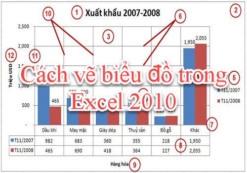
Drawing charts in Excel is an essential and extremely important task for accountants or those who frequently work with Excel. Knowing how to draw charts in Excel will help you present data and save time when illustrating statistical figures. If you don’t know how, don’t miss the article below from Softbuzz.
Let’s get started now.
Common Types of Charts in Excel
Before learning how to draw charts in Excel 2010, let’s explore some of the most commonly used chart types in Excel. If you don’t have the standard Excel 2010 installation, you can download it for free at.

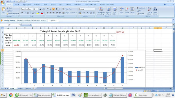
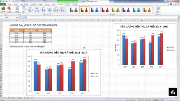
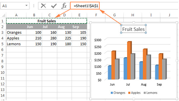
- Column: This is a vertical column chart, often used to display data over time. Types include: 2D column chart, 3D column chart, stacked column chart, and 3D stacked column chart.
- Line: A line chart visualizes data points over time, including: standard line chart in Excel, stacked line, marked line, 3D line chart, and more.
- Pie: A pie chart represents data as percentages within a circle.
- Bar: A horizontal bar chart, similar to Column chart.
- Area: An area chart used to illustrate data changes over time.
- X Y (Scatter): XY scatter chart, used to compare data pairs.
- Stock: A stock chart illustrating stock fluctuations, rainfall, temperature, etc.
- Surface: Surface chart combines data sets, with colors indicating the same value ranges.
- Doughnut: Doughnut chart shows the relationship between parts and the whole.
- Bubble: XY (scatter) chart often used in market research and financial analysis.
- Radar: A radar chart displays multivariable data, used to identify strengths and weaknesses.
How to draw charts in Excel 2010
To visualize data tables with simple and clear charts, users need professional tools. Drawing charts in Excel is a popular method among users. Here, we will explore the basic steps to draw charts in Excel.
See more
How to insert images into Excel
- Step 1: First, to draw a chart, you need to select the entire data table and click on the Insert tab. Then, in the Charts section, you’ll see various data representation charts to choose from. Click on the arrow icon to open the chart menu.
- Step 2: The Insert Chart interface with different chart types will appear for selection. Just choose a chart type and press OK. Immediately, this chart type will appear on the Excel interface.

How to edit charts in Excel 2010
After drawing a chart in Excel, users need to perform editing operations to improve it. The chart editing tools are most concerned with. When clicking on the created chart, three editing tabs will appear: Design, Layout, and Format. Specifically,:
- Design tab allows changing chart styles, layout, data, and chart colors.
- Layout tab is used for inserting images, shapes, textual labels, titles, etc., into the chart.
- Format tab edits shape styles, font styles, and sizes for the chart.

Conclusion
Above are some basic instructions on how to draw charts in Excel 2010 for beginners. Hopefully, these useful insights will help you complete your chart quickly. You can also apply these steps to draw charts in Excel 2013 or Excel 2016. The implementation steps are entirely similar.
Wishing you success!


