What are the features of Microsoft Excel that make it the world’s most used spreadsheet tool in 2025? From formulas and tables to PivotTables, charts, and automation, Excel combines powerful functions with ease of use, serving both beginners and power users.
As someone who has trained students, business professionals, and educators on Microsoft Office tools, I’ve seen firsthand how Excel transforms raw data into clear insights and smarter decisions. Its core features—calculation, visualization, collaboration, and automation—are why Excel remains essential across finance, education, research, and everyday tasks.
In this expert guide, you’ll learn:
-
The key features of Microsoft Excel and why they matter in 2025.
-
How beginners can master formulas, tables, and charts step by step.
-
Advanced features like PivotTables, automation, and conditional formatting.
-
Real-world examples of what Excel is used for in business, education, and personal projects.
-
Best practices to avoid common mistakes and improve efficiency.
Don’t worry if Excel feels overwhelming at first. By the end of this guide, you’ll understand not only the features of Microsoft Excel, but also how to use them effectively to boost productivity and data-driven decision-making.
What Are the Core Features of Microsoft Excel?
The core features of Microsoft Excel in 2025 include formulas, tables, charts, PivotTables, data validation, conditional formatting, collaboration, and automation. These tools make Excel the world’s most versatile spreadsheet software.
From my years of training beginners and advanced users, I’ve seen how just a few of these features can completely change how people work with data. According to Microsoft Docs, Excel offers over 400 built-in functions—proof that it remains the most widely adopted spreadsheet platform across industries.
Here’s a breakdown of the key features of Microsoft Excel every user should know:
1. Formulas & Functions: The Heart of Excel
Formulas and functions are Excel’s calculation engine, letting you automate math, logic, and lookups without manual work.
-
Examples: SUM, AVERAGE, IF, XLOOKUP.
-
Use Case: Add up monthly expenses, calculate student grades, or pull customer data by ID.
2. Tables: Organized and Dynamic Data
Excel Tables convert raw ranges into structured datasets that expand automatically and are easier to sort, filter, and format.
-
Use Case: Create an inventory tracker or maintain a clean customer contact list.
3. Charts: Turn Numbers into Insights
Charts transform plain numbers into visual stories, helping users identify trends, compare categories, and spot insights instantly.
-
Popular Types: Line, Bar/Column, Pie, Scatter.
-
Use Case: Visualize sales growth or display survey results.
4. PivotTables: Advanced Data Analysis
PivotTables let you group, summarize, and analyze large datasets dynamically—turning thousands of rows into clear, actionable insights.
-
Use Case: Summarize revenue by region and product to inform business strategy.
5. Data Validation: Keep Inputs Accurate
Data validation restricts what users can type into cells, ensuring accuracy, consistency, and error-free spreadsheets.
-
Use Case: Limit age entries to 18–65 in HR records or build dropdown menus for surveys.
6. Conditional Formatting: Spot Trends at a Glance
Conditional formatting applies colors, icons, and highlights to data so you can immediately see exceptions, risks, or opportunities.
-
Use Case: Flag overdue invoices, low exam scores, or highlight duplicate entries.
7. Collaboration Tools: Real-Time Teamwork
Excel in Microsoft 365 enables multiple users to edit, comment, and track changes at the same time, preventing version conflicts.
-
Use Case: Multiple team members editing a project budget sheet simultaneously.
8. Automation: Save Time with Macros & VBA
Automation with Macros, VBA, and Power Query eliminates repetitive tasks, making reporting and analysis faster and more efficient.
-
Use Case: Automatically format daily sales reports or batch-process large datasets.
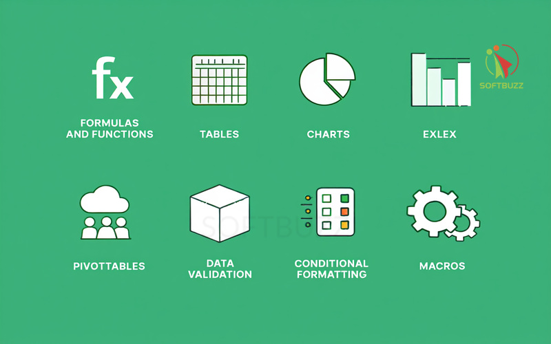
Quick Reference Table of Microsoft Excel Features
This quick reference table summarizes the main features of Microsoft Excel, along with their descriptions and practical use case examples. It helps beginners and professionals quickly see how each feature applies in real-world scenarios.
| Feature | Description | Use Case Example |
|---|---|---|
| Formulas & Functions | Automates math/logic | Budget totals, grading sheets |
| Tables | Structured data organization | Inventory, contacts |
| Charts | Data visualization | Sales trends, survey results |
| PivotTables | Summarizes large datasets | Monthly sales by region |
| Data Validation | Restricts incorrect entries | Financial models, survey forms |
| Conditional Formatting | Highlights data patterns | Budget alerts, grade thresholds |
| Collaboration Tools | Real-time teamwork | Group research projects |
| Automation | Speeds up repetitive tasks | Daily sales report formatting |
Formulas & Functions: The Heart of Excel Calculations
Formulas and functions are the backbone of Microsoft Excel, turning it from a simple grid of numbers into a dynamic calculation engine. A formula is a custom expression (e.g., =A1+B1), while a function is a built-in shortcut (e.g., =SUM(A1:A10)) that saves time and reduces errors.
As someone who has trained students, finance teams, and educators on Excel basics, I’ve seen how just a handful of functions can cut hours of manual work. According to Microsoft Docs, Excel supports over 400 built-in functions, spanning math, statistics, finance, and text analysis—proving why formulas and functions remain one of the most powerful features of Microsoft Excel.
How to Enter a Basic Formula in Excel
To create a formula in Excel, you simply start with “=” and combine cell references with operators. This instantly transforms static data into calculated results.
Step-by-step:
-
Click the cell where you want the result.
-
Type
=to begin the formula.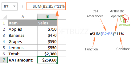
Excel Formula Elements -
Reference cells (e.g., A1, B1) and add operators (+, -, *, /).
-
Press Enter to calculate instantly.
Essential Functions for Beginners (2025)
These beginner-friendly functions are consistently ranked by Excel experts as the most useful starting points for new users.
-
SUM(range): Adds up values quickly.
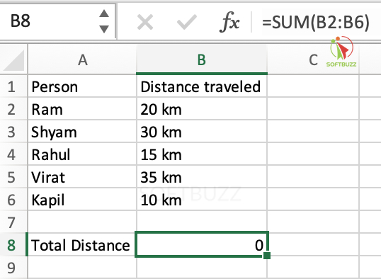
SUM -
AVERAGE(range): Finds the mean of selected numbers.
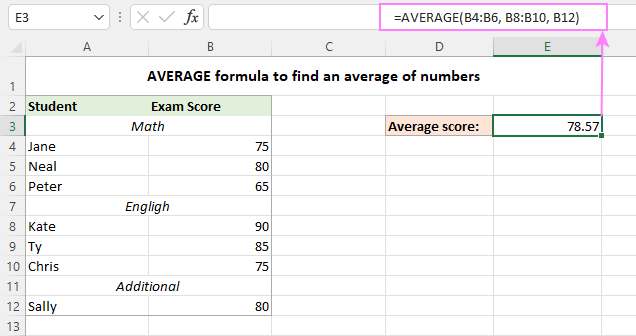
Average Formula -
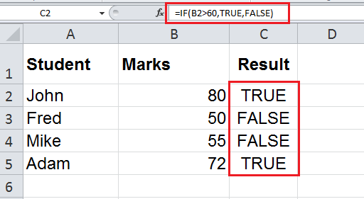
IF(logical_test, value_if_true, value_if_false): Applies conditional logic.
IF function -
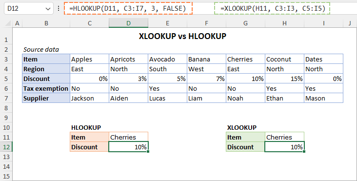
VLOOKUP/XLOOKUP: Searches and retrieves data from tables.
VLOOKUP/XLOOKUP
Real-World Use Cases
Formulas and functions make Excel practical across industries:
-
Budgeting:
=SUM()to total monthly expenses. -
Education:
=IF()to automatically assign grades. -
Business: Use XLOOKUP with tables to pull customer details by ID.
Troubleshooting Common Formula Errors
Even experienced users run into formula problems.
-
Syntax errors: Missing commas or parentheses.
-
Circular references: Formulas referring back to themselves.
-
Relative vs. absolute references: Use
$A$1to lock values when copying formulas.
Pro Tip: Use Excel’s Trace Precedents and Error Checking tools to debug formulas faster and ensure accuracy.
Why Formulas & Functions Matter
Mastering formulas and functions early is the key to unlocking advanced Excel features like Tables, Charts, and PivotTables. They are the foundation of efficient data analysis and automation, making Excel indispensable for beginners and power users alike.
Working with Tables for Organized Data
Tables are one of the most practical features of Microsoft Excel, turning messy datasets into clean, structured, and dynamic formats. Unlike a plain cell range, an Excel Table automatically expands as you add new data, supports built-in sorting and filtering, and integrates seamlessly with charts and PivotTables.
From my experience training small business owners, switching to Tables is often a breakthrough moment. It transforms hours of manual updates into automated, consistent workflows. According to Microsoft Docs, Excel Tables also use “structured references”—which makes formulas easier to read, audit, and maintain.
How to Create a Table in Excel (Step-by-Step)
Creating a Table in Excel is simple and only takes a few clicks.
-
Select your data range.
-
Go to the Insert tab and click Table.
-
Confirm the range and specify whether your data has headers.
-
Apply a preferred Table style for readability and consistency.
Best Practices for Using Tables
To get the most out of Excel Tables, follow these proven practices:
-
Filter and sort easily: Quickly isolate records, such as filtering a contact list by last name.
-
Auto-fill formulas: Any formula inside a Table extends automatically to new rows.
-
Dynamic charts: Link a Table directly to a chart so visuals update as data grows.
-
Consistent formatting: Apply uniform Table styles for professional-looking reports.
Real-World Use Cases of Excel Tables
Tables are highly versatile in both business and personal projects:
-
Project Management: Build a task tracker as a Table, then filter by status or deadline.
-
Small Business: Log daily sales in a Table and link it to a line chart for real-time revenue insights.
-
Education: Organize student records into a Table and generate instant grade reports.
Why Tables Matter in Excel
Switching from plain cell ranges to Excel Tables puts your data organization on autopilot. More importantly, Tables prepare your spreadsheets for deeper analysis with PivotTables, conditional formatting, and data validation—making them one of the most beginner-friendly yet powerful features of Microsoft Excel in 2025.
Charts and Data Visualization: Making Data Speak
Charts are one of the most valuable features of Microsoft Excel, turning raw numbers into clear, impactful visuals. Unlike plain tables, Excel charts make it easier to identify trends, compare categories, and communicate insights in a way that drives decisions.
From my experience helping teams prepare financial and business reports, I’ve seen how a simple line or bar chart can transform confusing spreadsheets into meaningful stories. According to Microsoft Docs, Excel provides more than 20 chart types—covering everything from quick category comparisons to advanced statistical analysis.
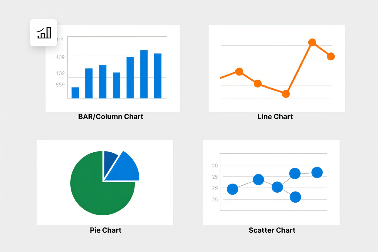
Common Excel Chart Types
Excel offers a wide range of chart types to fit different analysis needs:
-
Bar/Column charts: Compare categories side by side (e.g., monthly sales).
-
Line charts: Show trends over time (e.g., quarterly revenue growth).
-
Pie charts: Display proportions in a dataset (e.g., market share breakdown).
-
Scatter charts: Reveal relationships and correlations (e.g., hours studied vs. test scores).
How to Create a Chart in Excel (Step-by-Step)
Creating a chart in Excel is quick and beginner-friendly.
-
Select your data range, including headers.
-
Go to the Insert tab and choose a chart type.
-
Excel instantly generates a chart, which you can then customize.
Customization Tips for Effective Charts
To make your Excel charts clear and professional, follow these best practices:
-
Titles: Add descriptive chart titles so viewers immediately know the context.
-
Colors: Adjust for readability and align with branding or theme.
-
Data labels: Display values directly to improve clarity.
-
Legends: Use only when necessary—keep visuals simple.
Real-World Use Case
Charts make Excel practical in everyday scenarios:
-
Small Business: Track monthly revenue in a Table, insert a line chart, and instantly visualize seasonal peaks and dips.
-
Education: Plot student test scores in a scatter chart to reveal study patterns.
-
Corporate: Use a bar chart to compare product sales across regions.
This simple step not only improves presentations but also empowers data-driven decision-making. Combined with Tables and PivotTables, charts are essential for turning raw data into insights that anyone can understand.
PivotTables: Summarize and Analyze Like a Pro
PivotTables are one of the most advanced features of Microsoft Excel, designed to summarize, group, and analyze large datasets in seconds—without altering the original data. They let you spot patterns, calculate totals, and create dynamic reports that transform thousands of rows into clear insights.
From my experience teaching Excel workshops for finance teams, learning PivotTables is often a turning point: users go from feeling overwhelmed by raw spreadsheets to instantly uncovering trends. According to Microsoft Docs, PivotTables are central to Excel’s role as both a spreadsheet and a lightweight business intelligence tool.
Why PivotTables Matter
PivotTables matter because they turn static data into interactive reports.
-
Spot patterns quickly: Analyze sales by product, region, or month in seconds.
-
Drag-and-drop simplicity: Rearrange fields into rows, columns, and values for custom views.
-
Flexible analysis: Compare categories, calculate totals, and generate subtotals dynamically.
Beginner’s Step-by-Step Example
Here’s how to create your first PivotTable in Excel:
-
Click any cell inside your Table.
-
Go to Insert > PivotTable.
-
Choose a new worksheet (or existing one) for placement.
-
Drag Product to Rows and Sales to Values.
-
Optionally, drag Month to Columns for a time-based breakdown.
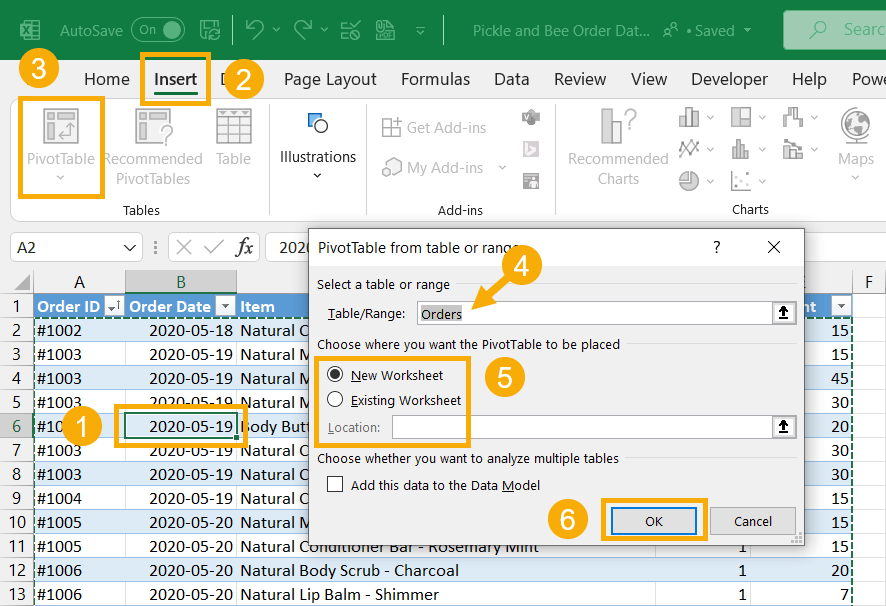
Insert PivotTable
Result: You instantly get a clear summary of total sales per product per month.
Real-World Use Cases of PivotTables
PivotTables are practical across business, education, and project management:
-
Business: Summarize quarterly revenue by region to guide strategy.
-
Education: Track student performance by subject and term.
-
Project management: Group expenses by category to monitor budgets.
Why PivotTables Are a Game-Changer
PivotTables not only complement Tables and Charts but also unlock multi-dimensional views of your data. For anyone wondering what Microsoft Excel is used for beyond basic calculations, the answer often starts with mastering PivotTables.
Data Validation: Keeping Your Data Clean
Data validation is one of the most important features of Microsoft Excel for maintaining accuracy and consistency. It restricts what users can type into a cell—such as numbers, dates, or dropdown lists—so you avoid invalid entries and keep your datasets clean and reliable.
From my experience training HR managers and finance professionals, data validation is often the feature that “saves the spreadsheet.” According to Microsoft Docs, Excel’s data validation is designed to enforce input rules across datasets, reducing human error and supporting automated workflows.
Why Data Validation Matters
Data validation matters because it ensures spreadsheets stay accurate and standardized.
-
Prevent errors: Block invalid entries (e.g., typing text in a numeric field).
-
Standardize inputs: Create dropdown menus for consistent answers.
-
Enhance accuracy: Reduce calculation mistakes caused by inconsistent data.
-
Improve workflow: Combine with Tables and Conditional Formatting to build reliable, automated reports.
How to Set Up Data Validation in Excel (Step by Step)
Setting up data validation in Excel only takes a few clicks:
-
Select the target cells.
-
Go to the Data tab → click Data Validation.
-
Choose criteria such as:
-
Whole number → restrict to ages 18–65.
-
Date range → only allow entries in 2025.
-
List of items → Yes, No, Pending.
-
-
For dropdowns, type allowed values separated by commas (e.g., Yes, No, N/A).
-
Confirm and test—invalid entries will trigger an error message.
Conditional Formatting: Visual Cues at a Glance
Conditional formatting is one of the most useful features of Microsoft Excel, allowing you to apply colors, icons, or styles to cells based on their values. It helps users instantly spot trends, exceptions, and errors that might otherwise go unnoticed in plain numbers.
In my experience working with students and finance teams, conditional formatting is often the “aha moment” where raw spreadsheets suddenly become interactive dashboards. Microsoft Docs highlights conditional formatting as a key tool for enhancing data readability and improving decision-making.
What Conditional Formatting Does
Conditional formatting works by applying visual cues according to rules you define:
-
Color thresholds: Shade cells above or below a target (e.g., budgets exceeded).
-
Highlight duplicates/trends: Use gradients to show frequency or patterns.
-
Status indicators: Add icons (✔, ⚠, ✘) for clear visual feedback.
How to Apply Conditional Formatting in Excel (Step by Step)
Applying conditional formatting only takes a few clicks:
-
Select your data range.
-
Go to the Home tab → click Conditional Formatting.
-
Pick a rule type (e.g., Greater Than, Text Contains, Duplicate Values).
-
Enter your criteria and choose a formatting style (color, icon, gradient).
-
Excel automatically highlights cells that meet the condition.
Real-World Examples of Conditional Formatting
Conditional formatting is practical across education, business, and project management:
-
Education: Color-code student grades below passing thresholds.
-
Finance: Highlight overspent budget rows in red for instant alerts.
-
Customer Data: Mark duplicate entries to maintain clean records.
-
Project Tracking: Use icons to show task status at a glance.
Why Conditional Formatting Matters
Conditional formatting doesn’t just make spreadsheets look better—it makes them smarter. By layering rules on top of Tables or PivotTables, you can quickly detect errors, spot opportunities, and simplify data-driven decisions. This makes it an essential part of the most beginner-friendly yet powerful features of Microsoft Excel in 2025.
Real-Time Collaboration and Sharing in Excel
Collaboration tools are among the most valuable features of Microsoft Excel in 2025. Integrated with Microsoft 365, OneDrive, and SharePoint, they allow multiple users to work on the same workbook simultaneously—seamlessly and in real time, regardless of location.
In my experience training corporate teams, collaboration often eliminates version chaos, helping groups move faster and avoid duplicate work. Microsoft Docs confirms that Excel’s co-authoring and version control make it a leading tool for teamwork across industries.
Key Collaboration Features in Excel
Excel collaboration tools ensure smoother teamwork and reduce errors:
-
Co-authoring: Multiple users can edit a workbook at the same time with live updates.
-
Comments & @mentions: Add notes and tag teammates directly in cells for clarity.
-
Version history: Track edits and restore previous versions if needed.
How to Collaborate in Excel (Step by Step)
Getting started with real-time collaboration is beginner-friendly:
-
Save your workbook to OneDrive or SharePoint.
-
Click Share and invite teammates via email.
-
Use the Comments pane to review, discuss, and assign tasks.
Result: Everyone works with the latest version, preventing conflicts and improving productivity.
Real-World Use Cases of Collaboration
-
Business: Finance teams working together on a project budget.
-
Education: Students co-authoring a group research assignment.
-
Reporting: Teams collaborating on dynamic dashboards with real-time data.
Automation and Time-Saving Tools: Macros & More
Automation is another powerful feature of Microsoft Excel, designed to save time by eliminating repetitive tasks. With Macros and VBA scripts, users can record or program sequences that run automatically with one click.
From my training with small business owners, automation is often a game-changer—turning tasks that once took hours into seconds. Microsoft Docs emphasizes that macros and Power Query extend Excel’s ability to automate and scale workflows.
Supplemental Content: Your Excel Feature Questions Answered
Below are answers to common beginner questions about the features of Microsoft Excel. This FAQ helps clarify essential concepts and supports your learning journey.
Q1: Is Excel good for large datasets?
A: Excel handles tens of thousands of rows effectively, making it suitable for small and medium datasets. For very large data (millions of rows), consider specialized tools like databases or Microsoft Power BI.
Q2: What is a formula in Excel?
A: A formula is an expression that calculates results using cell references and operators. For example, =A1+B1 adds two numbers, and formulas update automatically when data changes.
Q3: Which Excel features help with analysis?
A: The most useful features for analysis are Tables, PivotTables, Charts, and conditional functions like SUMIF/COUNTIF. These tools allow users to group, visualize, and calculate data for better insights.
Q4: How do Tables differ from normal ranges?
A: Normal ranges are static and require manual updates, while Excel Tables are structured datasets with built-in sorting, filtering, auto-fill formulas, and seamless integration with Charts and PivotTables.
Conclusion
The key features of Microsoft Excel in 2025 make it accessible for beginners while remaining indispensable for advanced users. By mastering core tools such as formulas, tables, charts, PivotTables, data validation, conditional formatting, collaboration, and automation, you can maximize both efficiency and accuracy.
Key Takeaways
-
Formulas & Functions: Automate calculations and save time.
-
Tables & Charts: Organize and visualize data more clearly.
-
PivotTables: Summarize and analyze large datasets instantly.
-
Data Validation & Conditional Formatting: Ensure accuracy and highlight patterns.
-
Collaboration & Automation: Enable real-time teamwork and reduce repetitive tasks.
From years of training students, professionals, and business teams, I’ve seen how step-by-step learning in Excel builds confidence and long-term skills. Start with foundational features, adopt best practices, and gradually explore advanced tools like Power Query or Power Pivot to scale your expertise.
If you’re ready to keep learning, explore more resources in our Excel and Office sections:
Visit Softbuzz for more practical guides and insights.
Which Excel feature do you find the most valuable—formulas, PivotTables, or automation? Share your thoughts below.


